From brand confusion to quality as a hallmark
The challenge
The previous prInsights and solutionsoduct design did not express Aalbæk’s values of organic produce, tradition and craftsmanship.
Every time Aalbæk introduced a new product line, it resulted in a new brand to differentiate across the supermarket chains. This created a lot of house brands that needed to be nurtured. At the same time, Aalbæk lacked recognisability and a common thread across sales channels.
Insights and solutions
The story of good craftsmanship had been lost in the handling of a myriad of brands, and the recognisability of the Aalbæk brand on supermarket shelves had disappeared.
This issue was resolved through a new and radical graphic identity for Aalbæk Specialities based on the company’s DNA and history, guided by a new brand strategy with Aalbæk as the overall brand. Each chain got their own packaging design, but now with Aalbæk as endorser and selected packaging elements as recurring themes.
New logo and label design
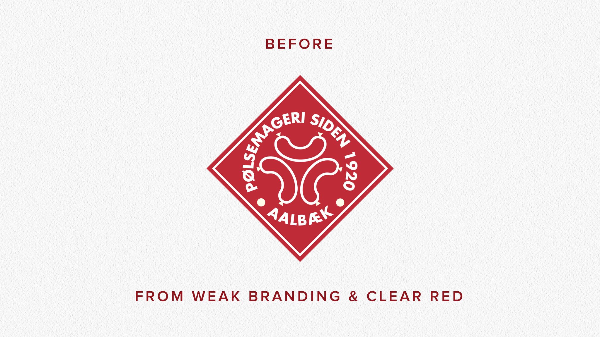
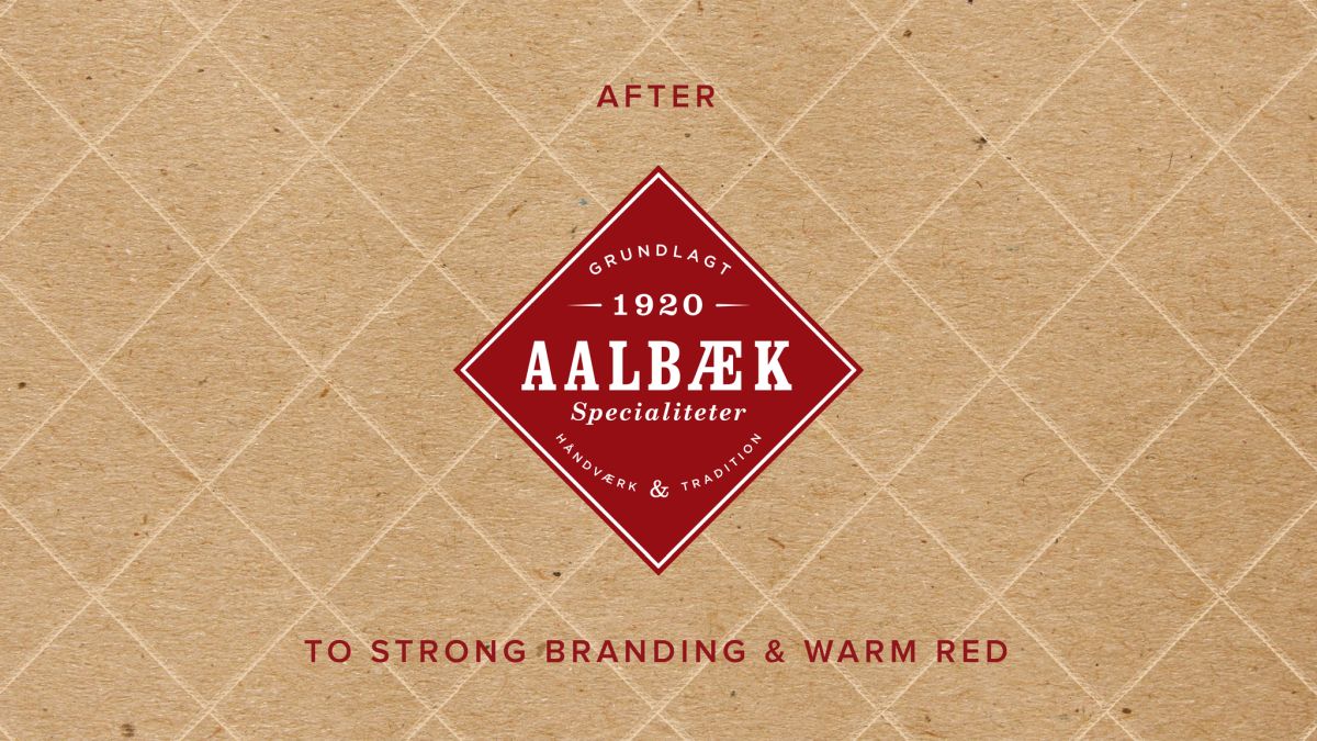
New logo design introduces a focus on details, history and values. It has a clear sender and a warm and approachable red colour.
New logo design introduces a focus on details, history and values. It has a clear sender and a warm and approachable red colour.


Results
The new, clear position expressed by the new identity has strengthened Aalbæk’s overall brand and ensured a higher quality perception of the products. The clear USPs of great taste, freshly made and produced in Denmark have resonated with consumers.
At the same time, the trend is for Aalbæk Specialities to be used for more occasions and for both lunch and dinner. The easily recognisable packaging design has helped build a strong brand across grocery chains and taste varieties.


